Saturday, April 20, 2013

[VIDEO] Drawn to Success with Tim Corey Pt. I


Before I dive into the actual conversation I share a bit of the backstory. When I initially decided to launch myself into the world of Graphic Recording (circa Nov/Dec 2012) I knew that eventually I'd need to have a blog (because that's what people in business do right). So on my calendar sometime off in the distant future (Spring/Summer of 2013, which by the way is NOW) I thought that I'd launch a monthly series of video interviews. Great!

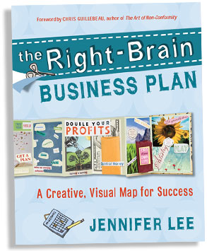
I wasn't going to start a blog, and thus the video series until I was clear on the direction of my business and everything was in a neat little row. But then in Jan I attended the Right Brain Business Plan online course via Creative Live (which I blogged about here). When I saw Tim Corey doing Graphic Recording for the course I KNEW I had to interview him, though I was far from my Spring deadline, at that point I didn't even have a blog to speak of.

Tim graciously accepted my invitation to have a conversation, and what was scheduled for a half-hour or so turned into about an hour long talk (chalk full of good info). I'd been waiting to figure out my branding messages/color/strategy etc. just so I can make the perfect intro slides. But after a virtual kick in the pants from Lynne Cazaly I figured there is no time like the present. So here's Part I of the video interview minus my oh so critical fancy schmancy title slides.

I've named the series Drawn to Success because I'd like to create some hand drawn visuals to depict each conversation. In this instance I didn't graphically record the whole convo, I just picked one nugget to represent graphically. I'll probably do at least one more for this portion of the conversation and then a few more pics for subsequent portions.

A graphic snippet of our conversation


*Disclaimer: This is my first vlog conversation/interview and isn't nearly as polished as I'd like it to be (I cringe when I see some of my facial expressions), but nevertheless in the interest of "just shipping it" I'm finally putting it out there. The first portion anyway, you'll have to come back for more (I know how sneaky of me). So just to make sure you don't miss the rest of the interview you might as well subscribe :) just sayin' make your life easier right!

For a bit of context this photo which was sourced from CreativeLive's Pinterest should help. If you are unfamiliar with CL they usually have 6 people in studio taking the course, while their hosts field questions/comments from the global audience online. In our conversation I asked Tim about his experience graphically capturing both what was going on in the room, and with the online audience. As you can see from this picture he's drawn an area dedicated to comments that were coming from the online community. 

At about 17:46 he also references a question that I posed via email:
So many times people think of Graphic Recorders as silent and off to the side, I really appreciated how Jennifer included you in the process asking you to reflect back what you heard not only through the visuals but by having you speak. Does that happen much? How was that for you?


FYI: In the video I mention briefly that I took Christina Merkley's Fundamentals of Interactive Visuals course online last winter. She actually runs a face to face course each Summer in Victoria BC, and there are currently only a few spots left. The course runs from May 30th- June 1st you can find more info here.

Thursday, April 18, 2013

Graphic Jam, I Have A Dream Edition


A while back, John Lesko led a graphic jam for D.C. area graphic recorders/facilitators/viz thinkers which he posted about on his blog here. From what I gather both from his post and from various social media posts of attendees the Jam went really well and it was fun to attend. I'd LOVE to go to an  informal graphic practice event like this, but thus far haven't found too many other people doing GR in the Philadephia Metro area (which can be a good or bad thing depending on how you look at it).

The I Have A Dream speech has been on my list of things to practice with (more on that later) and I figured why not use a linky and invite others to get involved (sort of a virtual jam session). So for those who don't want to read the whole backstory here are the instructions:

1. Choose a few metaphors to visualize from this list written by Todd Cherches
2. Draw them out
3. Blog about it
4. Link your blog post here so that we can come and visit


Oftentimes, visual communication is thought of as using graphical elements to communicate and organize ideas. However, in his blog post Todd Cherches dubs Martin Luther King, "King of Visual Communication," because of his ability to evoke images through his speech. In order to illustrate his point, Cherches pulled a list of metaphors from the I Have A Dream Speech. Using this list makes it easy to choose just a few metaphors to depict without having to listen to or read the whole speech.

I didn't want to trivialize the speech by making it too cartoony, but I did find the exercise of trying to put the metaphors in graphic form valuable. Of course if one was to actually GR the whole speech trying to draw out each and every metaphor would likely be counterproductive. In fact, in The Graphic Facilitator's Guide Brandy Agerbeck warns newbies not to latch on to imagery too quickly.


I've chosen the following ones from the list and depicted them below:
1. A great beacon of light and hope
2. The whirlwinds of revolt
3. Let freedom ring
4. A bad check which has come back marked insufficient funds
5. The quicksands of racial injustice
6. Satisfy our thirst for freedom


I originally read Todd Cherches article on the Duarte blog. If you are interested in delving deeper into the presentation aspects of this speech Nancy Duarte has a great video on how King uses elements such as repetition, and cultural references, in addition to imagery to make an all around compelling speech.

I look forward to seeing what you come up with :)

Thursday, March 14, 2013

Caught on the Web #2

In my first post in this series, Meet the Curator, I explained a bit about my social media philosophy, and basically how with all that goes on online it's so easy to miss good content. So from time to time I'll post a list of some things I found pretty cool.

First up is the sketchnotes challenge that Eva-Lotta Lamm is running over on her blog. She has gathered a panel of experts that will give challenge participants feedback on their submissions, imagine the guy who wrote the book on sketchnotes giving you his 2 cents, no really Mike Rhode DID write the book on sketchnotes and it is among the prizes that participants will be competing for. I've taken a peek at the other contestants and there are some really good entries (If you ask me I think the person who needs the MOST work should get Mike's book, at least then I'd be in the running.) Other prizes include Eva-Lotta's own books which are collections of sketchnotes from talks she's attended in a given year, and Brandy Agerbeck's The Graphic Facilitators Guide which I have and highly recommend.  I've posted a pic of my own submission below, make sure to trot on over to Eva-Lotta's blog for all the details the contest ends this Sunday, March 17th.


Next, in light of the really great discussion that has cropped up regarding my C.R.A.P. posts. I thought I'd share a slideshare about designing for presentation. This stood out because of the great use of storytelling which weaves through the whole piece and ties it together nicely. It is a good example of how stories can be used in concert with visuals to make presentations POP!


Design for Presentation: The great eye learns to see from Francis Glebas

Last on the list for this week is a playlist that I put together of videos from The Art of Hosting. As a Visual Thinking partner my aim is to work closely with facilitators to make the most out of group processess. To that end, I enjoy learning about various group facilitation techniques. The videos in the playlist each give a brief overview of various techniques and are helpful if you want to get the gist of a given practice. 

Saturday, March 9, 2013

C.R.A.P on the fly might make you the shiznit pt.2


In the first installment of C.R.A.P on the fly... I introduced the four major design principles,fondly known by the acronym C.R.A.P, which Robin Williams wrote about in her book,  The Design Book for Non-Designers.

Contrast

Repetition

Alignment

Proximity 

I've been using Anthony Weeks' work for a mini-case study exploring how graphic recorders might apply these design principles in the moment (on the fly). In post 1I covered contrast and repetition, so this time we'll jump into two new charts to see how alignment and proximity might come into play.

Alignment


Alignment is perhaps the toughest design principle to incorporate on the fly. In fact, it's honestly not that easy to do when doing studio work, if you don't draw guidelines in pencil. There are several different types of alignment, this post from printwand provides a more in depth explanation. For illustrative purposes I'll demonstrate here:


These lines of text
are left aligned


These lines of text are 
    right aligned 

These lines of text are 
center aligned  


There is also a type of alignment called justified, where the text is lined up on both the left and right, but it wasn't showing up right in blogger. 

The most popular alignment in printed materials designed for reading is left (think of the default setting in your fave wordprocessing program), whereas centered alignment is generally reserved for things like titles or other things that should stand out and aren't large blocks of text. When text is aligned it gives the eye a straight edge to move down when starting to read each line (our eyes like that), rather than a jagged edge where each line in a paragraph or other related block of information starts at a different place. And let's admit it we're lazy and having all the text lined up makes it easier to scan as well. Though alignment is a good thing, you don't have to go overboard and try to justify blocks of text, it's ok to have left aligned text with a jagged right edge, apparently that creates white space (and we like white space).  Another quick note on left-aligned vs justified is that left-aligned is generally seen as more approachable and friendly, which fits well with graphic recording, justified text is more stodgy (think strict newspaper columns).

Obviously, in graphic recording there is not one left margin that acts as a magical line for text. So if one is trying to align text they have to use several imaginary lines. While every single block of text above isn't aligned the majority of it is, and generally the text that isn't aligned is either indented or wrapped around an image. 

I've pulled out two portions of text to illustrate this point and made the invisible lines visible, though I didn't make a line for the bullets in the list on the left, notice that they too are aligned.


I also learned from Christina Merkley that lining up text makes it easier to go back and put boxes around it latter, and boy do we love boxes containers :)

Proximity


Last, but certainly not least is this graphic recording done of Patrick van der Pijl as he spoke about Business Model Generation. There is a lot going on in this chart, I don't know how long the original talk was but I'm familiar with the book and it looks as if he was giving a broad overview both on how the book came about and what it actually says. Proximity in a nutshell means that if things are close together, people assume they are related.  You can see that like things are indeed grouped together so that the answers to a given question are in close proximity to the box container holding the question itself. This is also where other elements such as contrast and repetition come into play which further help us differentiate between information. This design element requires balance because while you want white space in order to let things breathe a bit, placing them too far apart makes them seem unrelated. There are areas where a particular word might seem to drift off (see the "Why was Business Model Generation so Impactful" question in the bottom right and notice that "technologies" is further away than the other answers), however the use of dotted lines connects the text to it's anchor and reels it back in so it doesn't get lost in the sauce.  

Proximity also relates to how close an icon is to the text it is supposed to illuminate or drive home. Again look at the "so impactful" question notice how the computer is right next to "online revolution," had it been somewhere else on the page it wouldn't have worked. The same can be said for the coffee placed right next to the word Nespresso, one could have easily moved the cup down so that it sat right next to the list, rather than the title (after all the whole list relates to Nespresso), but it would take more mental gymnastics to figure out why a coffee cup was next to "What are the channels?."


So now that I've finished picking apart Anthony's work, I'll return to my original premise. I supposed that if one was able, in the moment, to apply all four basic design principles they would indeed be the shiznit. In this case, at least, I believe that my hypothesis was indeed correct.

Saturday, March 2, 2013

C.R.A.P on the Fly Might Make You the Shiznit- Pt.1


  A Case Study w. Anthony Weeks


C.R.A.P

C.R.A.P. is pretty ubiquitous in the graphic design world, and by that I don't mean poor quality work (though there is plenty of that), instead C.R.A.P. is actually a litmus test to help define excellent design. It is an acronym that refers to four basic design principles, as described in The Non Designers Design Book, by Robin Williams.


Contrast

Repetition

Alignment

Proximity

If your aren't familiar with these principles,  I'd suggest viewing the following SlideShare presentation by Diane Tchakirides based on the work by Robin Williams. She does a good job of presenting each principle and giving examples.

On The Fly 

I was interested in exploring how C.R.A.P might be applied to the field of graphic recording/facilitation. Unlike, graphic artists or web designers who can employ grid lines, play with design elements, move things around, or use software to align text; graphic recorders would need to apply C.R.A.P on the fly (meaning live in real time). C.R.A.P defines good design because it relates to how our brains work, and how information can be optimally organized to facilitate comprehension and improve readability.

I figured if anyone was applying C.R.A.P on the fly their work would be the shiznit, and I set out to find someone to use for my impromptu case study. I think Anthony Weeks' work is pretty awesome, so I'm thankful that he is allowing me to use his work to illustrate how C.R.A.P On The Fly might play out. Though pretty much all of the work that I've seen from him applies all of these principles, for the sake of this post, I'll just highlight one principle per piece. Your challenge if you choose to accept it, is to identify the other ones, you can point them out in the comments section if you like. So here goes... The images below are all original work done by Anthony Weeks, and are subject to the original copyrights.


Contrast

The chart above, is a great example of how contrast can be used effectively in graphic recording. There is plenty of contrast going on, which allows viewers to easily distinguish information, and to quickly find the most important points. The title font is used to show the two main areas of the chart, and is easily differentiated from the body text based on color, size, and style. The use of green capital lettering in the body text makes the important points "pop" and is in contrast to the black lower case writing which provides more detail.

In addition to helping page elements stand out from each other, contrast also functions to help elements stand out from the white background. Shading/shadow is used throughout the chart to provide depth and break up the white space. The white boxes around the numbers and exclamation pints are a good example of how a little shadowing set them apart from the background. The use of pastels also provides contrast that helps the graphic elements stand out from the background.

Repetition


There are several visual elements that are repeated above, which helps unify the whole piece. Graphic recording is traditionally done on large sheets of paper (4x8 or so), and the gist/tone of the conversation/speech, etc. may change. The above example shows how repetitive elements like color, or shape can help tie the chart together even if the information being presented is different. 

The repetition in this chart is most obvious where you see lists of things. The first list on the left hand side of the paper for instance, employs  pink checkmarks for each point, and each point is written in blue. There are several different groups of information presented in this chart and the use of bullets, and shapes helps the viewer differentiate which points go with each section. For instance in the middle of the chart there are three different sets of info being presented, the information that falls under the statement "there was a need for change" is set apart with thought clouds ( notice too that the cloud shape is repeated at the top of the chart, and even in the bushes at the bottom); The info related to "economic crisis" uses only pink marbles as bullet points with no container; and the information related to "How do we operate as a system?" are set within rectangles with rectangular but still pink bullets). 

Repetition however, doesn't necessarily mean using the exact same element over and over. This chart also uses arrows as a repetitive element that helps guide the eye around the document, but arrows vary in size and style. The little sparkly stars around the title are also repeated across the top of the page this time in a different size and color, yet it still feels unified. 

Lastly, color is also an element that can be used repeatedly to add a sense of consistency. Though it is hard for me to actually restrain myself when I have a set of markers on hand, some graphic recorders are really good at using a limited color palette with great results. I personally love the effect of just using the black, pink, yellow and blue. The colors are used very intelligently and consistently, the pink is repeatedly used for bullet points, and the dark blue is used within the text to help key words stand out. 

Overall the repetitive elements not only make the piece visually appealing, but help to aid understanding by highlighting key words and showing connections between pieces of information. 

So that does it for this installment of C.R.A.P, in the next post I'll take a look at two more charts from Anthony Weeks and see how he uses alignment and proximity.  


Monday, February 25, 2013

We Came, We Saw, We Co-Learned


Last Friday, Feb 22nd I organized a co-learning event, graciously hosted by Business Casual Coworking, in Bristol, PA. If you aren't quite sure what I mean by co-learning, I introduced the concept in a previous blog post.

We all got together to watch Day 1 of Ryan Holiday's creativeLive course Smart PR for Artists, Entrepreneurs, and Small Business. The event went really well, it was a small crowd but I think that we all agreed that there was a benefit in coming together vs watching the course solo at home. Having assembled a group I really wanted to try out Gamestorming, so we did the Lo-Tech Social Network on our first break. During subsequent breaks we were able to chat about the course content and general social media strategies for business. Though interacting with people face to face was great, I don't think we got the full effect of being connected with the global audience since we didn't interact much through chat. I will say though on the creativeLive end, this particular course on this particular day didn't seem to integrate as many questions/comments from the net as I've seen in previous courses. So to that end it was good that we had each other to bounce ideas off of and get clarification on things. For future events, I'll have to figure out if there is a better way to balance the two.

Because I like to combine high touch and high tech (and love Web 2.0 tools) we wrapped up by using polleverywhere to gather feedback.


Here are some shots from the event, uploaded from my phone. I was also taking visual notes during portions of the class and I've included those here too.

Overall I think it was a good event, and I look forward to doing it again!

Saturday, February 16, 2013

Meet the Curator...

According to Dictionary.com to Curate is to pull together, sift through, and select for presentation.

Lately, this word curate keeps coming up for me both in terms of what I see as my role as a visual practitioner and my overall philosophy on social media. Let me explain, 

As I've been mulling over business taglines, messaging and such, one line that keeps sticking with me involves the word curate. Why? As a graphic recorder one has to listen intently to a conversation and try to sift through it for the important "nuggets" and then find a way to translate that information into a visual presentation. Thus as a museum curator would sift through information and then develop a display that conveys meaning and value, so to does a graphic recorder. 

Now onto my social media philosophy. If you've ever read ANY article on how to use Twitter for business (which it is clear that many people haven't). Social Media 101 says, DO NOT use Twitter or other social sites for that matter only to toot your own horn. Unless your line of business is reality TV or some other form of entertainment, people really don't follow you to find out about the minutia of your day (sorry if I'm the first one to break it to you). People DO follow you because you should be adding value to their lives, you know something that they don't, you share the same interests, you are a thought leader or carry some type of social capital in a given field.

We come across soooo much information that it's quite impossible to filter it all. So we look for curators who we can relate to in some way that  essentially say hey, there were 100 million articles published in the time it took you to log into Twitter, but here are the one's that you might find interesting. However, since information does come a mile a minute by the time you log into your Twitter or FB feed an article/slidedeck/video/etc. that you might have found amazing is buried somewhere on your Timeline that will never see the light of day. 

Sooo I say all that to say that in order for these awesome things not to get lost in the sauce, I'd like to on a somewhat regular basis (perhaps weekly), compile a list of some of the things I've come across on the web (perhaps 5), that I think would be of interest to my followers. 

While most of these things will likely be in the realm of visual communication, I'll also probably include things related to creativity/innovation/design thinking; small business and entrepreneurship, and instructional design/e-learning. So if you're interested go ahead and subscribe via RSS so you don't miss out!

So to kick this off, I'll share some pretty awesome things I've come across recently on the web:

1) Hot off the Presses (we'll ok e-books don't use presses but I couldn't resist) is Jeannel King's e-book What You Draw Is Good Enough is available for FREE 

2) ImageThink has put together a great slide presentation on how to get the most out of your graphics

Got Visuals? How to Use Graphic Recording to Make Your Event Unforgettable from ImageThink

3) Great TED talk by Todd Henry...seriously where can I get my "Die Empty" T-shirt


4) Who doesn't love a good infographic, Here's one to point you to social media success (it's what us instructional designers would call a job aid) be prepared to scroll...  Manage Social Media the Easy Way in 2013 [INFOGRAPHIC]
via: Manage Social Media the Easy Way in 2013 [INFOGRAPHIC]

Wow, you stuck around and made it all the way down here. I hope you enjoyed, and you'll be visiting again soon.  

Monday, February 11, 2013

A Co-Learning Event

I've only recently become hip to the co-working scene and so far, I've found it to be a really vibrant community based on an awesome premise. If you aren't familiar with co-working the idea essentially is to address the need for solopreneurs/freelancers, and other work from home types to socialize, and be in an environment that fosters productivity. I can attest to the fact that sitting at home, in comfy PJs waiting to switch the next load of laundry, isn't really the best way to foster productivity and get work done. People used to address this by working from a local coffee house or library which gets you out of the house, but essentially still alone. One of the best things about going to a traditional workplace are the other people you work with (usually, ok maybe not all of them but a chosen few) the quintessential gatherings around the junk food vending machine water cooler, and the ability to pop your head into a colleagues office/cubicle to run an idea by them, get some help, or just chat. This is where coworking spaces, or informal coworking meetups (called jelly) come in. A group of people get together to do their own individual work, network, motivate each other, provide a sense of community, etc.

Another really popular trend these days are MOOCs (massive open online courses), and other opportunities to learn new things online, for free, with a global audience. Fortunately, there is some really great content out there, being given away for FREE by people who actually know what they're talking about. Some of these forums even include an interactive component that allow learners to chat with fellow learners, build upon the content, and even interact with the lecturer. A great example of such a platform is  creativeLive, (which I spoke of in my last blog post). These courses are also generally accessed on an individual basis.

I thought wouldn't it be grand if the two ideas were combined. What if a group of people got together in order to learn things that would benefit them in their respective businesses. Coming from an education background, I could see how this could be a powerful idea, allowing people to expand on their learning by having real-time face-to-face conversations about the content. Thus the idea for co-learning was born. Now I know I'm not the first to think, hey let's get together and watch this class. BUT I may be the first to give it a hashtag (the specific tag I'm still working on).

All that being said, I'm organizing a co-Learning event, at an awesome new coworking space in Bristol, PA on February 22nd. I used Smore, a new Web 2.0 tool to make this online flyer check it out and feel free to share!

Wednesday, January 30, 2013

My Right-Brain Business Plan Experience


The weekend before last, I  attended the Right-Brain Business Plan (RBBP) workshop virtually via the brilliance that is creativeLIVE. For those of you who are unfamiliar with the RBBP it is a creative and highly visual method of business planning created by Jennifer Lee. The RBBP is an approach for those creative entrepreneurs who'd usually want to curl up in a ball at the thought of having to do a traditional business plan.

Before I proceed I have a confession to make. To be quite honest, the thought of writing a business plan doesn't make my skin crawl. Not to say that I relish spreadsheets, but writing an executive statement (no that's not a curse word) or an operations plan isn't totally outside of my wheelhouse. In fact when I was an undergraduate (cough cough) years ago, I was in an entrepreneurship certificate program which was more or less four semesters worth of business plan writing. Not to mention that I used to work as a grant writer, which requires some of the same skills.

All that being said, I was still really interested in Jennifer's method. Just because I don't find business plan writing terrifying, doesn't mean I wasn't up to trying an approach that seemed infinitely more fun. I also knew that I eventually wanted to become licensed to facilitate RBBP workshops so this was a good way to get a front row seat, and for FREE to boot!

Yes, I did say Free. For those who are unfamiliar with creativeLive, they attract awesome instructors who are experts in their respective fields, and offer 1-3 day courses for free via livestream. If you miss out on the live course, or just want to re-watch at your own pace to soak up all the learning, you can purchase the videos which are well worth the price. The experience with creativeLive was top-notch, they do a great job of engaging the online audience and really bring you into the experience so you don't feel like you're passively listening to a zzzzz lecture. I'm saying this as someone who is studying e-learning, so I'm pretty picky about what I consider quality online learning experiences.

So back to the #RBBP these are the things that resonated with me:
  • The sense of community that formed in the creativeLive chatroom, which also extended to other social media sites like FB, and Twitter. In fact one of the participants Beth Olson took the initiative to start a FB group for the participants and it still serves as a great space where people are continuing to share their dreams, goals, and successes with plenty of community support and feedback. 
  • I did some collaging... OK more like copying and pasting.
  • The business self-portrait exercise was enlightening. I asked four different people to describe me in three words, and all of them said creative
  •  I'm trying to launch a business as a graphic recorder (GR), so that fact that they had Tim Corey come in to do graphic recording on day 3, made me feel as if I was in the right place. It was the first time they'd had a GR in a creativeLive course and seeing/hearing the reactions of the participants and how they valued his contributions helped to solidify my resolve.
  • I recently signed up for a mentor via MicroMentor to help me develop my branding/marketing strategy, and we'd scheduled a call smack-dab in the middle of  Day 3, so I had to step away for an hour. One of the first things my mentor @RobWolfe asked was what my core values and business personality were. He encouraged me to just do a brain dump and then we'd work together to pick the top 3 values/personality traits. However, because I'd been engaging in the RBBP I was crystal clear and was able to tell him that My Core Values are: Creativity, Clarity & Collaboration and My Business Personality Traits are: Energetic, Unorthodox & Engaging Rob actually has an MBA and has helped other entrepreneurs gain clarity on what their brand footprint is (as he likes to call it), the fact that he asked some of the same questions that Jennifer did validated that indeed business planning via collage is in fact productive! 
 It's funny because Jennifer, who seems really diligent about self-care, told a little story about her "date with Destiny", Destiny being the name of her massage therapist that she'd had the day prior to the workshop. On day 2, I was actually supposed to be going to my cousin's baby sprinkle which was also a spa party. As the mother of an 8 month old, one might say I'm waaay overdue for some self-care and I was quite looking forward to going. But alas, I stayed home because I didn't have enough milk stored up. Though I was happy to be tuning in to the RBBP I was feeling a bit down because yet again I'd missed an opportunity for "me time" and let that little voice that was telling me that I didn't really deserve that facial, manicure, and pedicure win out.  I share this because I now feel like staying home and engaging in the RBBP course (albeit with two little people swarming around me) was a form of self-care. I was able to make new contacts, gain clarity about my business, and got the kick in the pants to finally launch this blog. 

On that note, I ought to turn in. I'm quite excited that tomorrow (rather later on today, considering it's 1:40 am) I'll be conducting my first Skype interview to launch my Drawn to Success interview series with none other than Tim Corey! and I don't want bags under my eyes :) 

Disclosure: The links to the Right-Brain Business Plan website are affiliate links, however I do wholeheartedly endorse the product.